Beach Sunrise Canvas for Living Room: Honest Review
The morning I hung the CANVAS ON DEMAND Beach Sunrise Canvas Wall Art Print by Alex Hanson, the whole living room stopped pretending it wasn’t missing something.
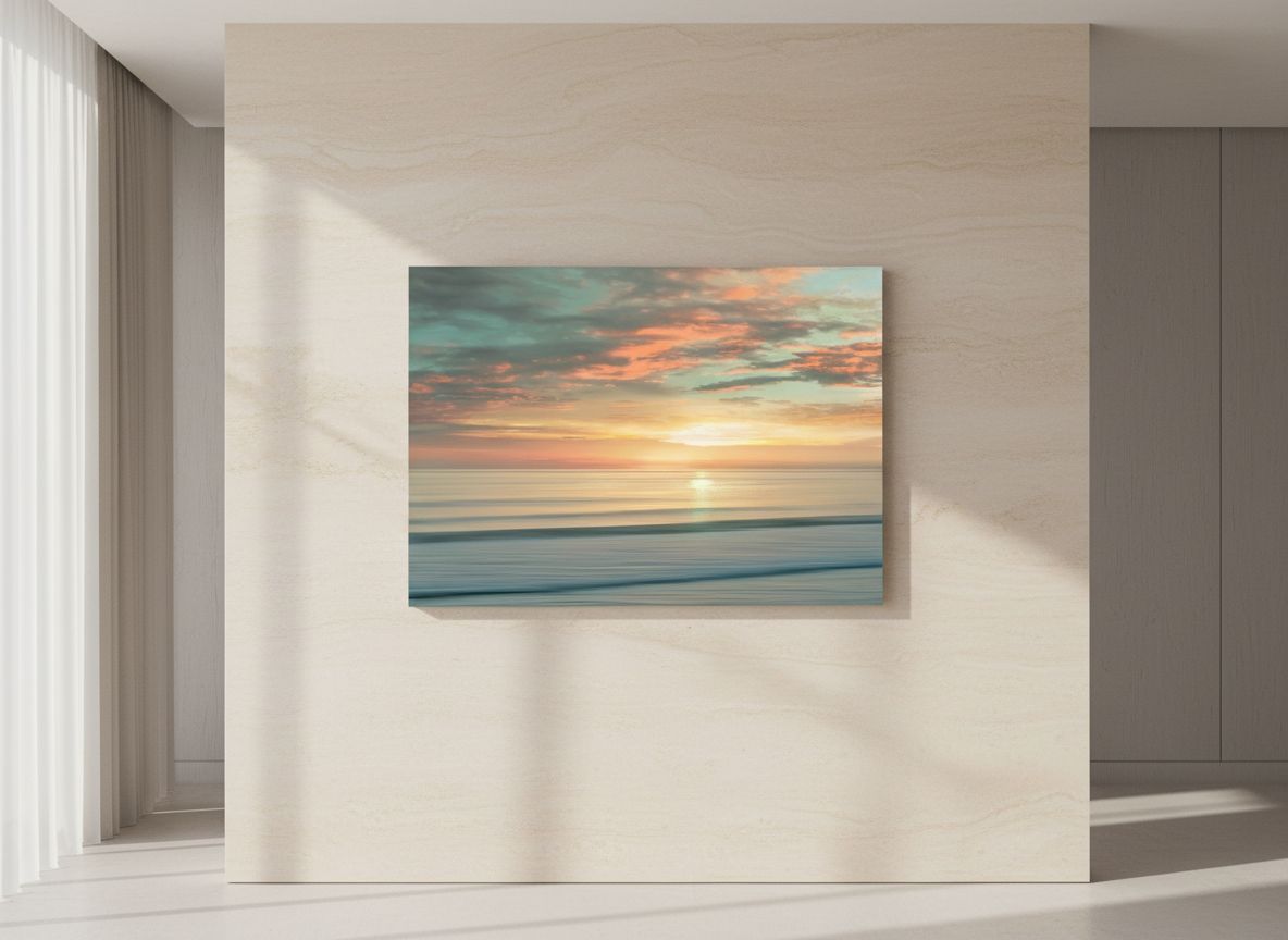
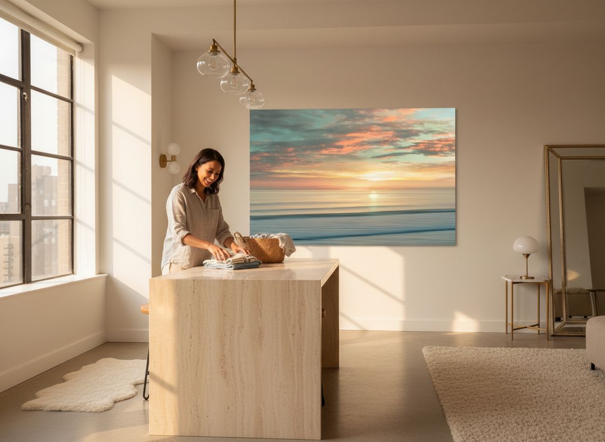
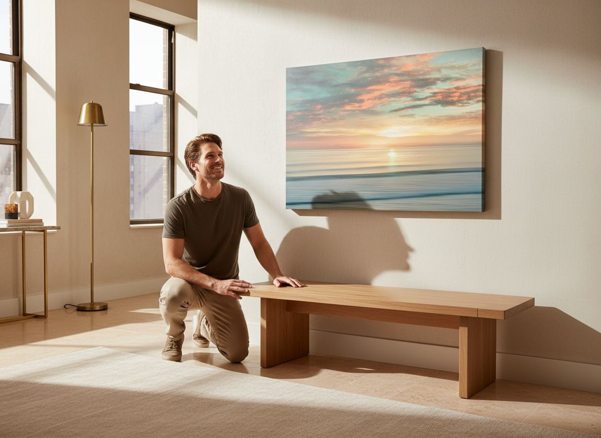
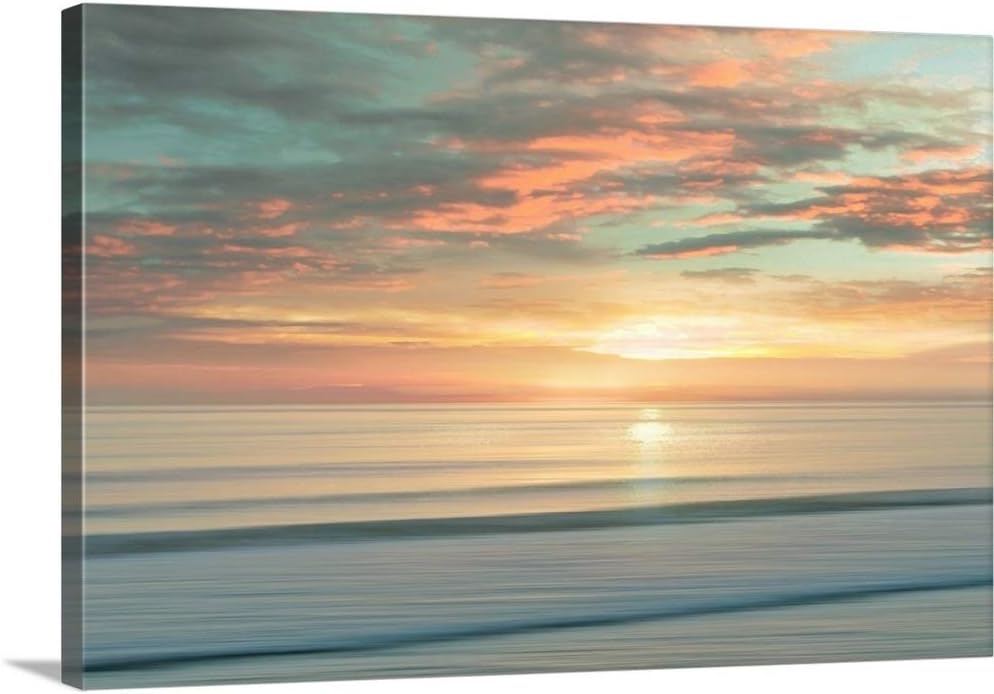
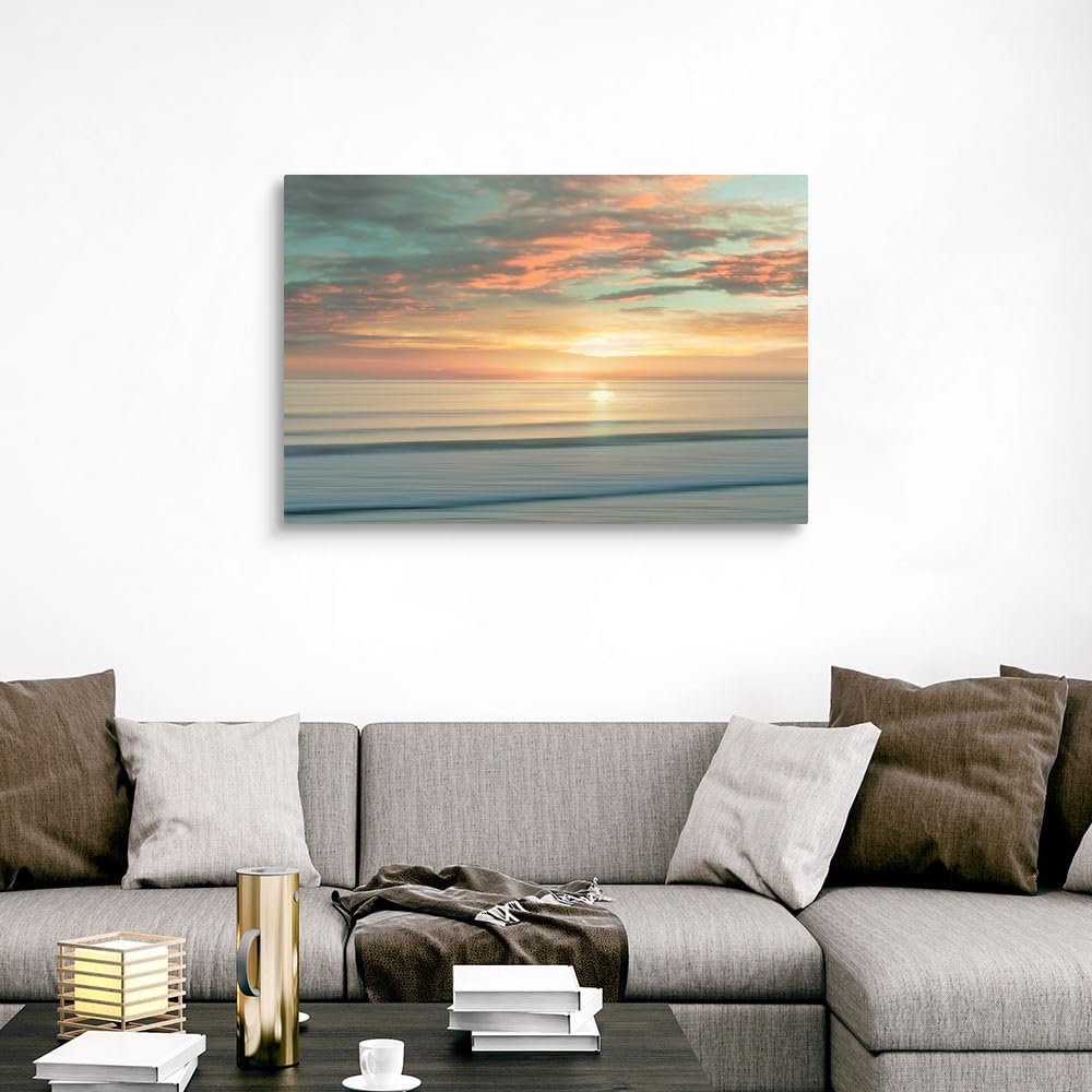
There is a particular quality of light in my apartment on weekend mornings, the kind that comes in low and amber through the east-facing windows and lands on whatever is directly across the room. For two years, that wall held a small gallery arrangement I had convinced myself was “curated,” but was really just three frames I’d grabbed on sale and never fully committed to. Then a 48-by-32-inch stretched canvas arrived, and I spent a Saturday morning with coffee going cold on the side table, just sitting with it. **The gradient across the canvas, all warm peach dissolving into a horizon blue, pulled the morning light into itself like it had been designed for exactly this room.** It hadn’t, obviously. But that is the particular magic of a piece that gets the color balance right.
The First Time I Saw It
I came across this print the way I find most things now, mid-scroll on a Tuesday night with a glass of wine and the loose intention of “refreshing the living room.” I had been looking at living room wall art options for weeks without conviction, clicking past the predictable abstract prints and the slightly-too-rustic coastal scenes that felt lifted from a beach rental. This one stopped me. The composition is horizontal and expansive, and even scaled down on a product page thumbnail, the gradients read with a depth that most digital prints lose entirely.
What caught my attention specifically was Alex Hanson’s brushwork texture, visible even in the listing photos. This wasn’t the flat, poster-quality ink dump I’d been accidentally ordering. It felt like it had been made with some intention. I added it to my cart, then closed my laptop, then reopened it twenty minutes later and checked out before I talked myself out of it again.
How It Actually Lives in the Room
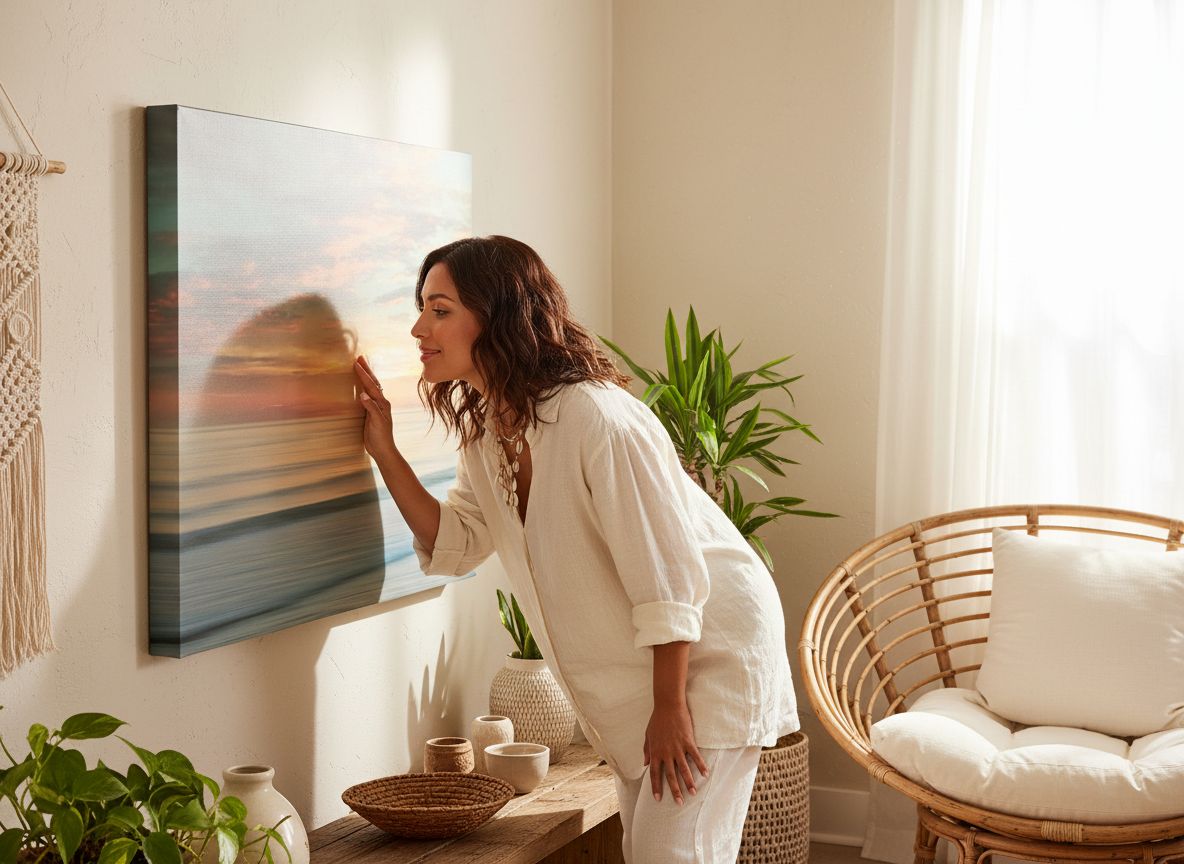
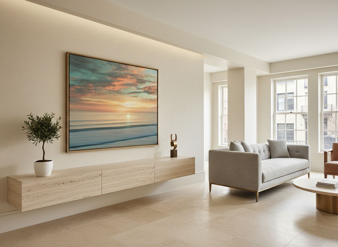
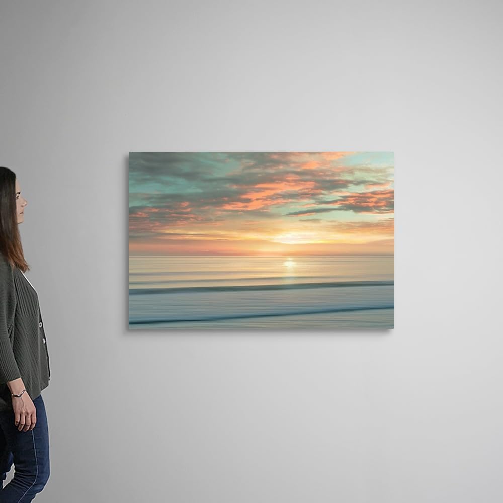
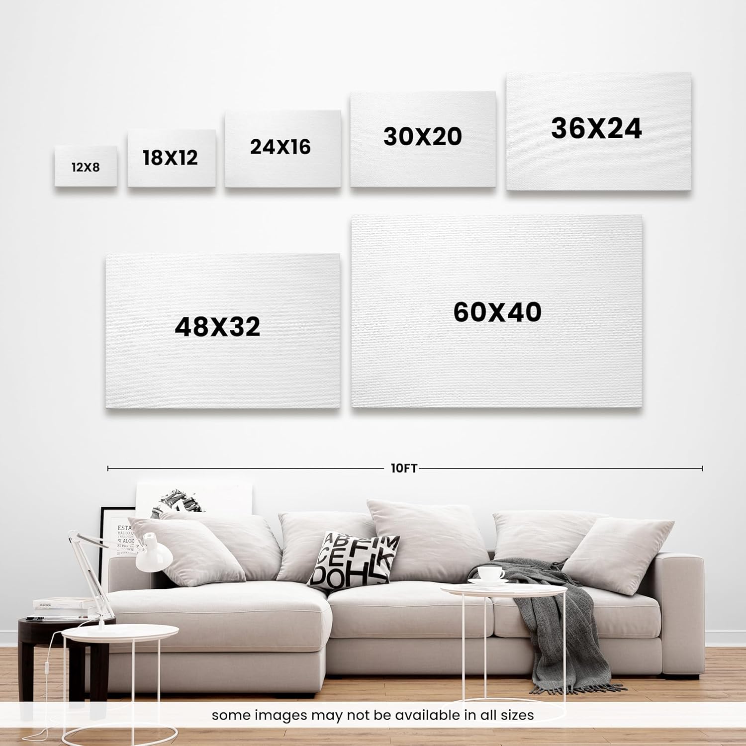
Oversized living room wall art is one of those categories where the concept sounds right but the execution often goes wrong. Too large for the wall and it crowds. Too generic in palette and it reads like hotel decor. This piece, at 48 inches wide, hits a proportional sweet spot for a standard eight-foot wall without consuming it. The canvas is stretched and mounted cleanly, with enough depth on the frame that it sits off the wall with real presence, casting a faint shadow along its bottom edge that somehow makes it look more like an original work than a print.
“The gradient doesn’t just sit on the wall. It changes the temperature of the entire room depending on the hour.”
I should be honest about one thing: the colors photograph warmer on screen than they arrive in person. The oranges are slightly more muted, the blues a touch more gray-leaning in lower light. This is not a complaint, actually. The real-life version feels more sophisticated than the listing suggests. If you’re looking for a vivid, saturated tropical print, this reads a little more subdued and editorial. For anyone building a contemporary coastal living room rather than a beach house playroom, that restraint is the whole point. Interior styling communities have long argued that the best large-format art is the kind that recedes just enough to let the room breathe, and this piece understands that assignment.
The Vignettes I Actually Built Around It
Vignette 1: Sunday Morning, Coffee and Slow Light
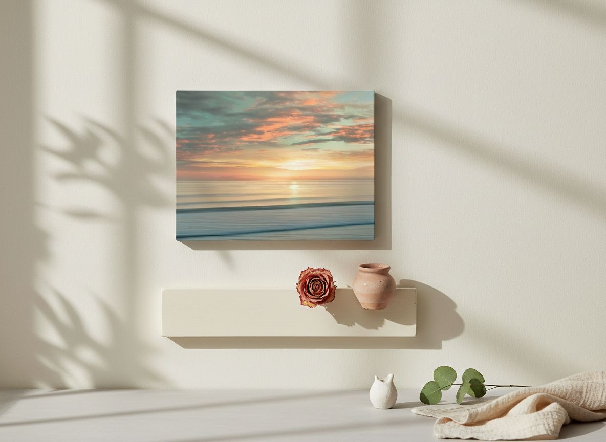
The canvas faces my sofa directly, which means it’s the first thing I see before I’m fully awake. I’ve started leaving the blinds half-drawn on weekend mornings so the natural light can do something interesting with the gradient. Paired with a cream linen sofa, a low rattan side table, and a ceramic planter with a trailing pothos, the whole corner now reads as a cohesive slow-living vignette that I genuinely didn’t plan. The warm orange in the canvas echoes the terracotta pot. The ocean blue in the upper horizon repeats in a vintage glass bottle I’d nearly thrown out. It made my existing things make sense.
Vignette 2: The First Dinner Party of the Season
I had eight people over for dinner in March and strung some warm-toned Edison lights along the opposite wall. By the time we moved from the table to the living room with our wine glasses, the canvas was catching the warm bulb light and glowing in a way that made two separate guests ask if it was an original painting. It wasn’t, and I said so, but at this price point the question itself felt like a win. One friend, who works in set design and has strong opinions about art, stood in front of it for a moment and said it was “not trying too hard.” I chose to take that as the highest compliment.
Vignette 3: A Rainy Wednesday Night
This is the test I give all large-format art: how does it look when the mood is bad and the light is flat? On a gray mid-week evening with rain on the windows and the overhead lights off, the canvas shifted character entirely. The warm tones quieted down and the blue horizon took over, giving the piece a cooler, more contemplative mood than the product photos would suggest it’s capable of. It felt, unexpectedly, like looking at the ocean through a window. I put on a playlist and didn’t move for an hour. That kind of quiet company from a piece of art is something I don’t take lightly.
What Other People Are Saying
With 133 ratings and a 4.3-star average, the feedback on this piece clusters around a few consistent themes. Buyers are repeatedly noting that the colors read richer in person than on screen, which aligns exactly with my experience, and that the stretching and framing quality holds up to scrutiny when you’re close to it. A handful of reviewers flagged that the canvas arrived with minor corner dings from shipping, which is worth knowing before you schedule that dinner party. A few noted it runs slightly smaller than they expected despite the listed dimensions, though I’d guess that’s more about spatial imagination than actual sizing.
The 4.3 rating for a large-format print in this tier feels accurate and honest. It’s not a perfect product. But the people who love it tend to really love it, which is usually the more useful data point.
Who Should Skip It
If your living room skews dark, moody, or dramatically saturated, this print will likely fight with your palette rather than settle into it. The warm earth tones and gradient blues are built for rooms with natural light and a relatively neutral base. Maximalist spaces with lots of pattern, dark jewel-tone walls, or heavy traditional furniture will absorb this print without letting it speak. It also won’t satisfy someone looking for bold, graphic contemporary art. The mood here is specifically serene and painterly, and if that’s not the register you’re working in, no amount of repositioning will make it feel at home. Those drawn to rustic, farmhouse, or heavily industrial aesthetics should probably look elsewhere, too. See our curated collection of living room decor ideas for broader style directions if this one doesn’t feel like your match.
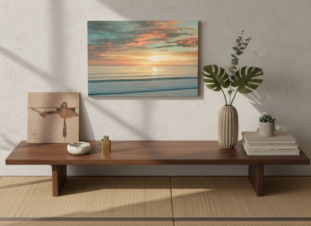
What It Replaces in My Space
I replaced a trio of small framed botanical prints that I had convinced myself formed a cohesive arrangement but were really just filling space out of obligation. They were fine. That’s the problem with fine. Fine doesn’t do anything for a Tuesday night when you need your home to feel intentional. This canvas replaced not just those frames but also the ambient sense that the living room was still a work in progress. There’s something about a single, committed piece of oversized art that says the room is done, at least for now. It also replaced a nagging habit of browsing endlessly through contemporary wall art prints on weekends, which, honestly, is its own kind of value.
For anyone sitting on a similar accumulation of placeholder art, this is the kind of one deliberate swap that makes everything else in the room suddenly look more considered than it actually is. Explore our editor’s top decor picks if you’re building out a full room refresh around it.
FAQ
Will the 48″ x 32″ size work on a standard living room wall?
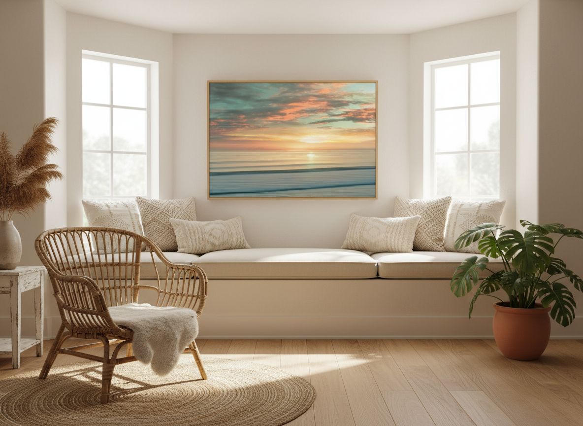
For most eight-to-nine-foot walls, yes. The piece works best anchored above a sofa or console, with at least six inches of wall visible on either side. If your sofa runs longer than 84 inches, you’ll want that breathing room even more.
Does the canvas surface feel textured, or is it smooth like a photo print?
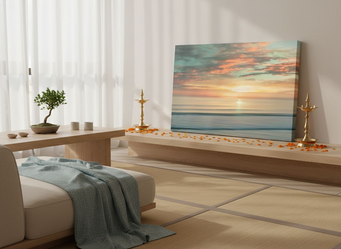
There is a mild canvas texture visible at close range, which contributes to the painterly effect. It’s not dramatically thick, but it’s enough to distinguish it from a glossy photo paper print and give the surface some visual interest in raking light.
Where in a room does this work best?
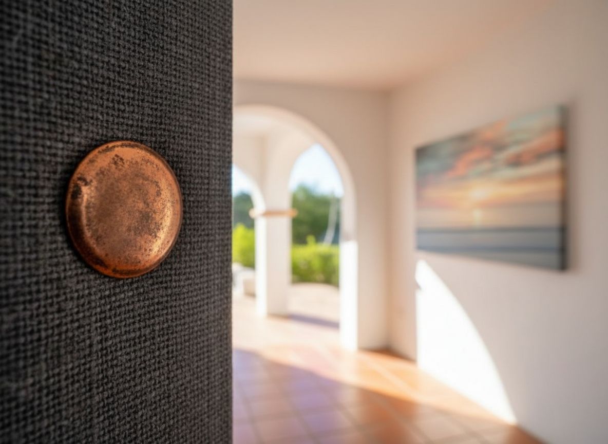
Living rooms and primary bedrooms are the strongest placements. The print’s horizontal format and ocean-horizon composition make it a natural fit above a bed or sofa. A home office with good natural light could work beautifully too, especially if you want something calming across from your desk. For complementary floor-level texture, our living room rug picks include several options in warm neutral tones that pair well with this palette.
Is the quality consistent with what the brand charges for it?
For what you’re paying, the finish is notably strong. The stretching is tight, the frame is solid, and the print quality holds up when you’re standing directly in front of it. The value reads above what you’d expect in this tier, particularly given the oversized dimensions.
What should I know about assembly or returns?
The canvas arrives ready to hang with a standard wire mounting on the back, which makes installation straightforward. A few buyers have reported minor shipping damage on corners, so inspect carefully upon arrival. CANVAS ON DEMAND does have a customer service process for damaged items, so document any issues immediately before hanging.
The Verdict
I keep thinking about that Sunday morning, coffee cooling, the light doing something unrepeatable across the canvas gradient. Six weeks in, I still pause in front of this piece when the morning light hits it right, which is something I have not done with any other art I’ve owned in this apartment. The CANVAS ON DEMAND Beach Sunrise Canvas Wall Art Print by Alex Hanson is, at its core, a piece about mood, and it delivers that mood across different times of day, different weather, and different emotional registers in the room. It is not the right fit for every space or every style, and I’ve tried to be clear about who should skip it. But for a contemporary coastal living room that needs one confident, committal piece to pull itself together, this is one of the better living room wall art investments in this category. Given the level of finish and the sheer scale you’re getting, the value reads above what you’d expect for an accessible weekend find.
For anyone who finds themselves endlessly rearranging small frames and never feeling quite settled, consider this a friendly nudge. Pair it with a few living room throw pillows in warm coastal tones, step back, and let the room finally look like you meant it. If you’re building a broader room refresh, this print belongs on the shortlist of thoughtful home decor gifts worth considering, too. The design sensibility of slow, considered rooms is exactly what this piece serves. And if you’ve been searching for the best living room wall art for a contemporary coastal space, a Kinfolk-influenced approach to calm, purposeful interiors will find real company in this canvas.
One large, honest piece of art beats five uncertain ones every time.
Every Angle
The piece as photographed for Amazon — front, side, back, detail.
As an Amazon Associate I earn from qualifying purchases.