Blue Gold Canvas Art for Living Room: Worth It?
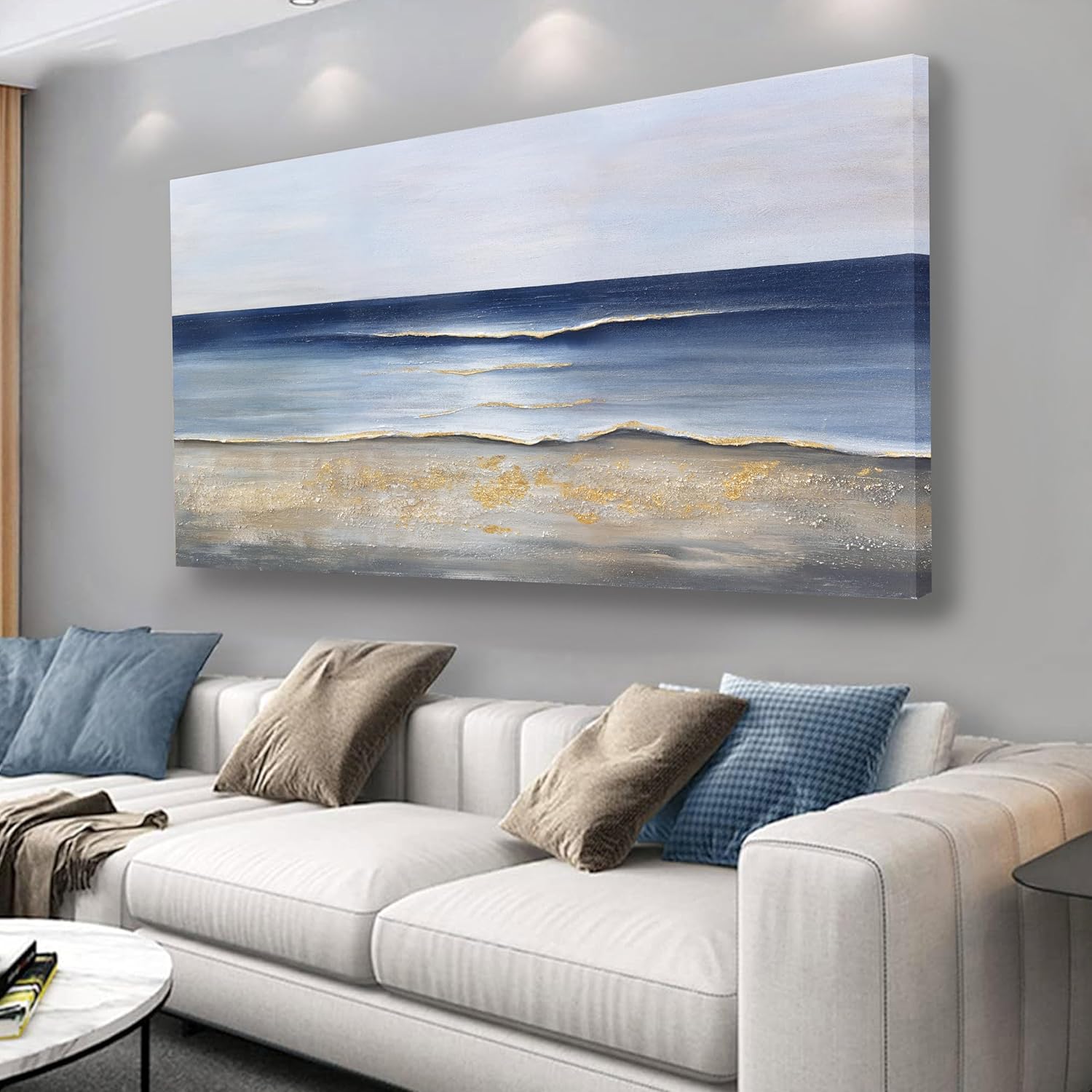
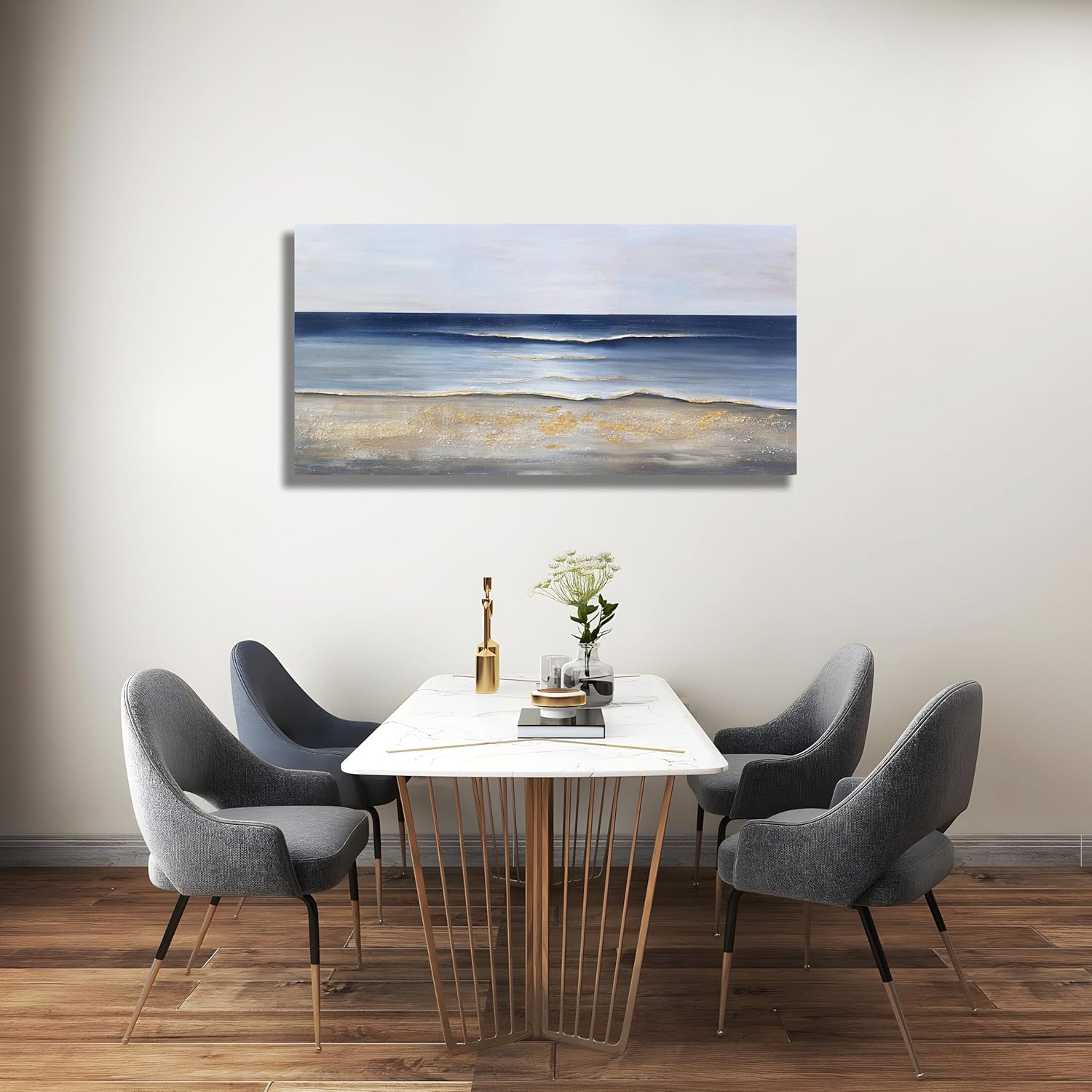
The moment a 30×60-inch canvas of deep blue and burnished gold went up on my living room wall, the entire room stopped being a collection of furniture and started feeling like somewhere.
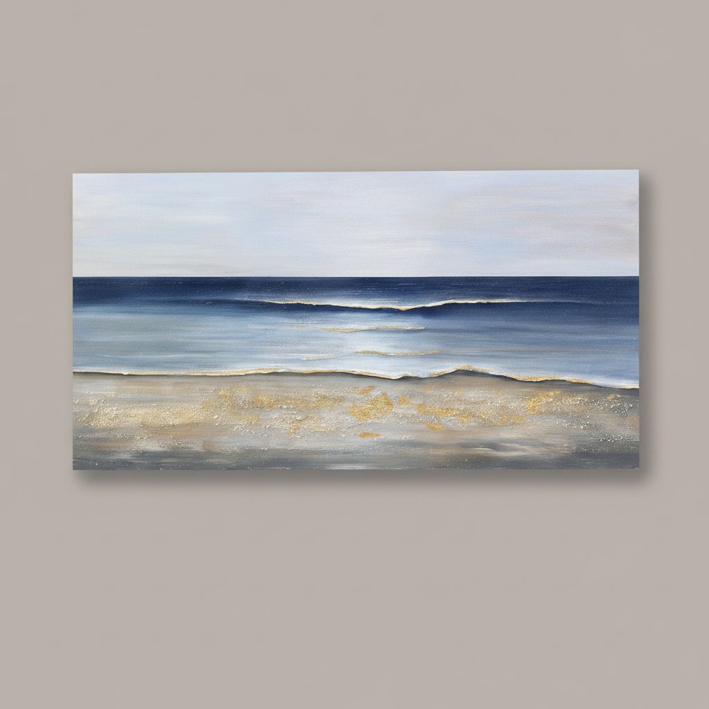
It was a Sunday in late October, the kind where the light comes in low and amber through the west-facing windows and everything in the apartment looks either very beautiful or very tired. My living room wall art had been a problem I’d been circling for months. A large expanse of white above the sofa, two failed gallery wall attempts abandoned midway, a single framed print that looked, honestly, like a placeholder. I’d ordered the Yuaxker Ocean Canvas Wall Art on something close to a whim, drawn in by the blues, and when I finally pulled it out of its tube and unrolled it onto the floor before hanging, I sat with it for a long minute. The deep ocean palette, those strokes of cool cobalt and teal shot through with gold, caught even the flat afternoon light and gave it something back.
The First Time I Saw It
I was doing what I do every few weeks, scrolling through listings with my morning coffee, not really looking for anything specific and, therefore, looking for everything. Large-scale abstract art is one of those categories I’d been researching for a while without pulling the trigger. Most pieces in this tier either go too safe (pale watercolor shapes, inoffensive beige palettes) or too aggressive (moody black-and-white photography that reads more office lobby than living room). This one stopped me because of the gold.
There’s something about a well-placed metallic accent in an ocean-themed composition that refuses to feel like beach house kitsch. It reads closer to what you might find in a carefully styled home featured in Architectural Digest, where the coastal reference is impressionistic rather than literal. I bookmarked it, closed the tab, and reopened it three times before I just ordered it. For what you’re paying, the 30×60-inch format felt like the obvious gamble to make.
How It Actually Lives in the Room
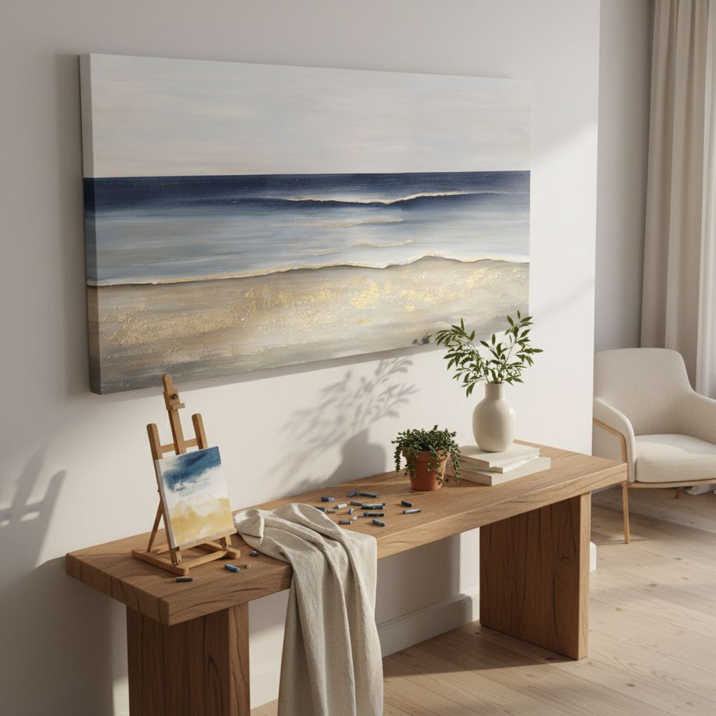
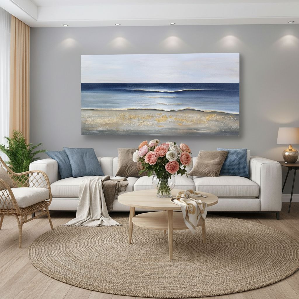
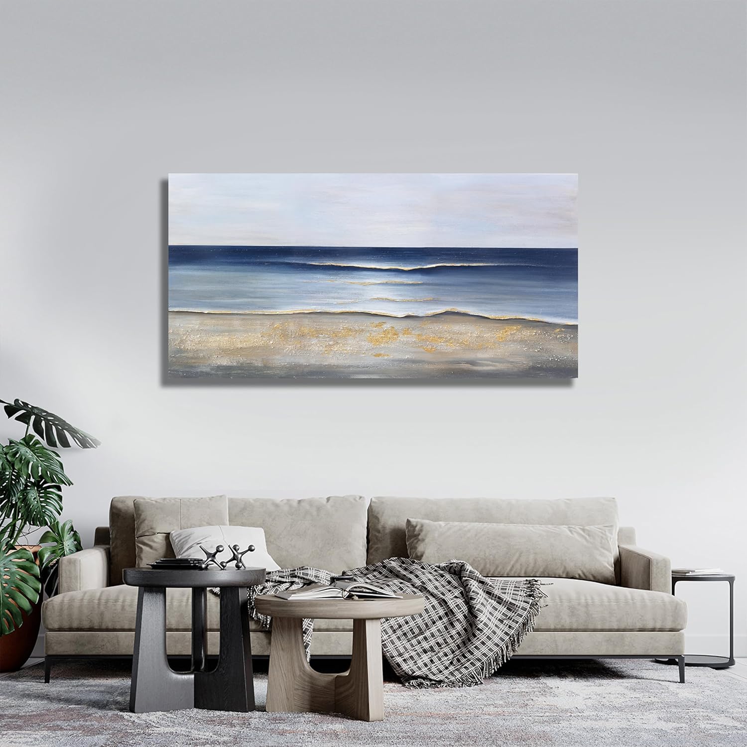
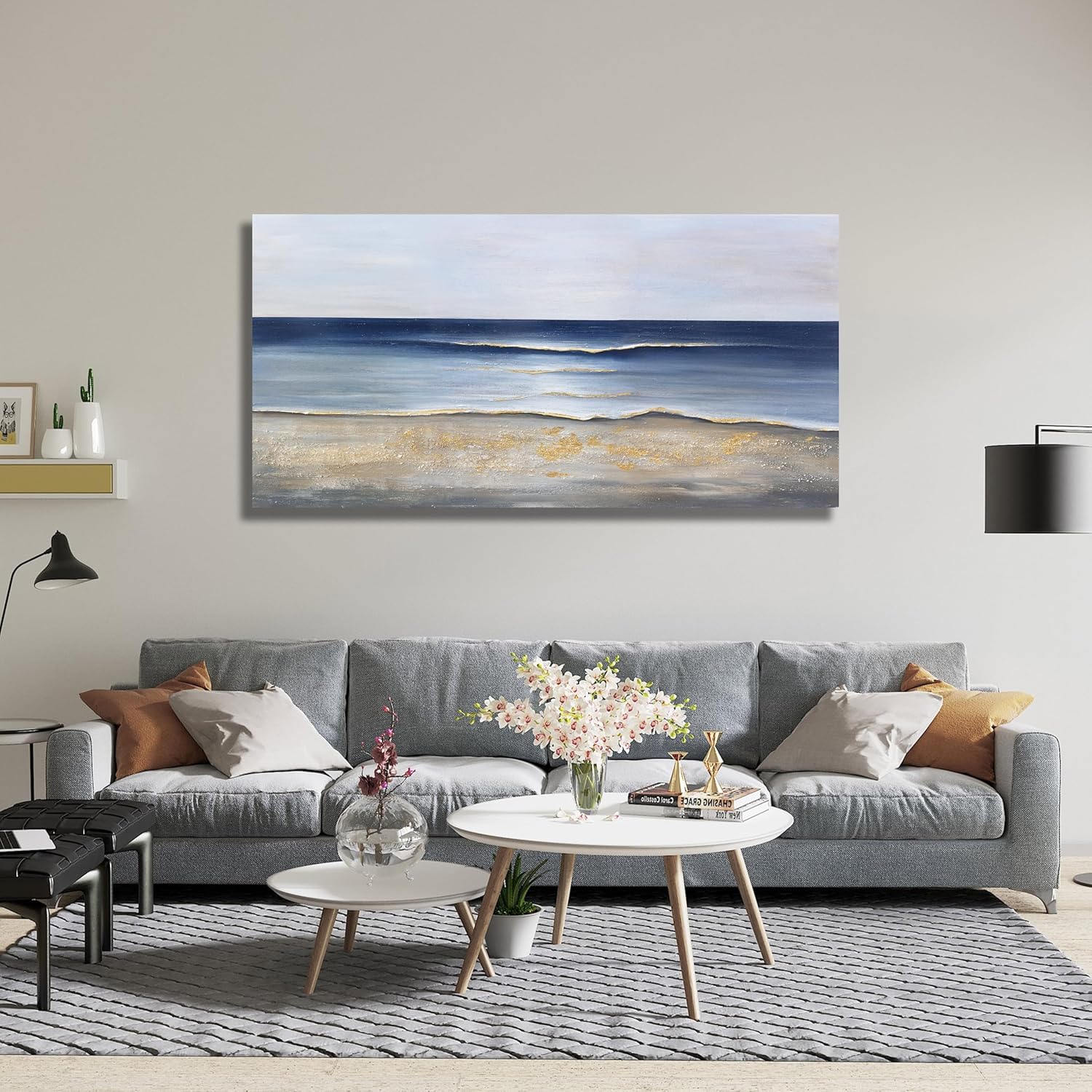
The canvas arrived rolled, and I want to be honest about this: the first fifteen minutes after unboxing involved some anxiety. A piece this large demands the right wall, and even a few inches off-center will announce itself immediately. Once it was hung, though, and I stepped back to look, I understood why the format exists. A 30×60-inch living room canvas art piece does something a grid of smaller frames simply cannot, which is to anchor the visual weight of a full sofa wall without competition. It doesn’t share space. It owns the wall, and somehow makes the room feel larger for it.
“The gold accents don’t glitter, they glow. There’s a real difference, and this piece knows it.”
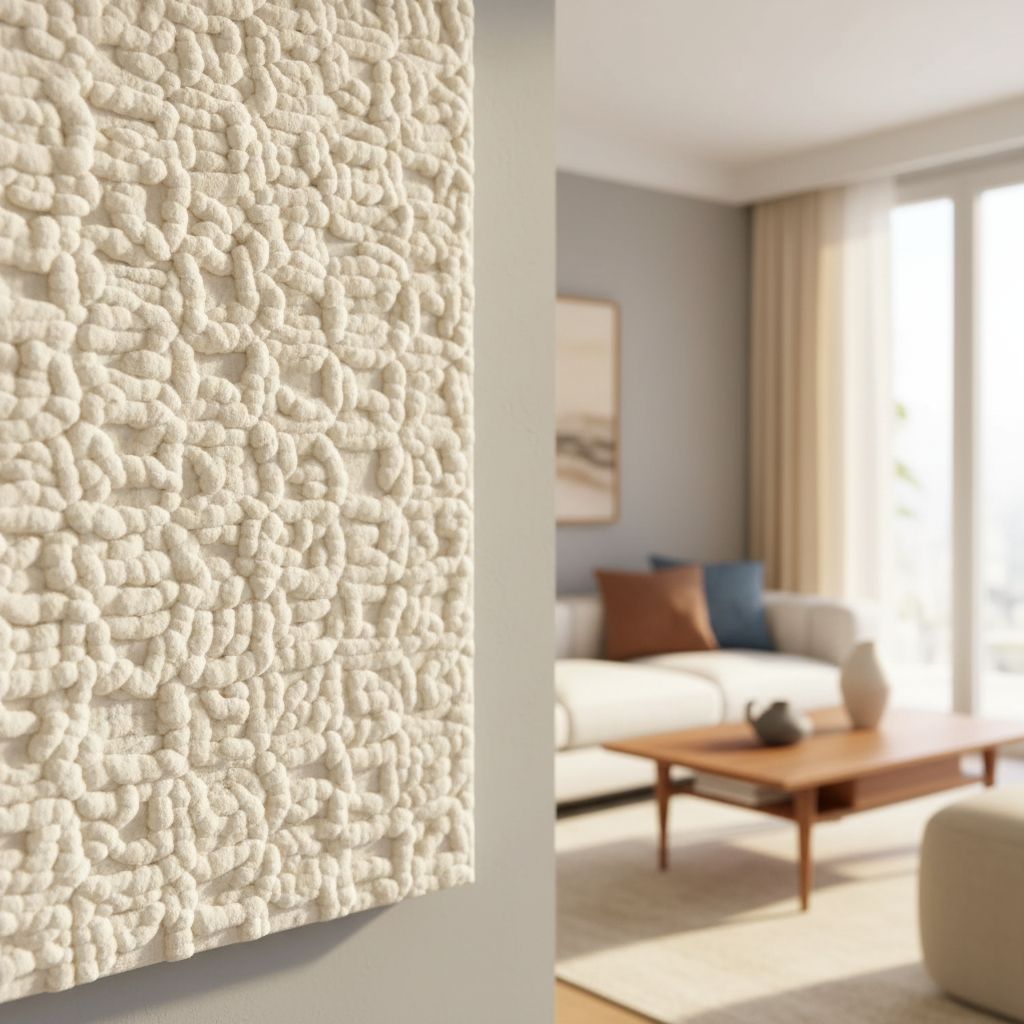
The canvas texture is visible up close, which I appreciate. It has some tooth to it, enough to catch raking light differently in the morning versus the evening, which means the piece never quite looks the same twice. The blue palette shifts from near-navy in the darker passages to something almost cerulean where the paint thins. One honest note: the abstract patterning is assertive, not background art. If your room is already carrying a lot of visual noise, textured rugs, patterned upholstery, bold shelving, this will compete rather than complete. Rooms that benefit most are ones with breathing room. You can find useful guidance on balancing bold statement pieces against other furnishings in Elle Decor’s room-styling coverage, which consistently handles this tension well.

The Vignettes I Actually Built Around It
Vignette 1: Tuesday Morning, Before Anyone Else Is Up
My living room faces east in the mornings, and the early light hits the left side of the canvas first, warming the cooler blues and making the gold genuinely luminous. I’ve started taking my coffee there on purpose now, sitting in the chair across from the sofa wall and looking at it before the day starts. I’d paired the canvas with a low-profile ivory linen sofa and a natural rattan side table, and that combination, cool canvas, warm naturals, works in a way that feels considered without being overdone. There’s a small trailing pothos on the shelf below it. The organic shapes in the painting echo the plant without being matchy, and that little accident of good design is one of my favorite things about the space now. It is one of those corners where I genuinely want to sit, which I didn’t used to be able to say. For more ideas on pairing statement art with soft furnishings, explore our living room throw pillow picks to find complementary textures.
Vignette 2: First Dinner Party of the Season
I had six people over in November, a proper dinner with candles and too many wine glasses on the table, and the living room was where everyone eventually ended up for the rest of the night. Without fail, someone commented on the canvas. Not in the polite way people gesture at art to fill silence, but with actual attention. One friend, who works in interiors, walked up to it and stood there for a moment. “Is that oil?” she asked. It isn’t, but the depth of the color in candlelight gave it that impression. That is the right kind of mistake to be made about a piece. The gold accents, which read as elegant rather than flashy in daylight, took on something genuinely warm against the candles, and the whole room felt more intentional for it. Our living room wall art category has more options if you’re hunting for a piece with similar presence.
Vignette 3: A Rainy Friday Night, Just Me and the Room
There’s a specific quality of silence in a room when it’s raining outside and you have nowhere to be, and I’ve started to think of my living room differently since this canvas went up. The blues feel less decorative on those nights and more like atmosphere, like the wall itself is doing weather. I had a floor lamp on behind me, one of those with a warm Edison bulb, and the indirect glow across the canvas was genuinely beautiful in that unplanned way. I’m not the kind of person who usually writes sentences like “the room felt complete,” because that framing tends toward the precious. But this piece closed something in the space that had been open and faintly bothering me. Big art in a living room is less decoration than it is architecture. It reorganizes everything else around it. If you’d like to layer in more texture beneath it, our curated living room rug guide pairs well with this kind of statement anchor.
What Other People Are Saying
This piece has accumulated a substantial number of reviews for a single canvas, and the consensus is useful if you read past the five-star enthusiasm. The pattern I noticed: people are consistently surprised by the physical scale once it arrives, often in a good way, and the color accuracy gets high marks relative to product photos, which is not always a given in this category.
The most credible signal in the reviews is the repeat mention of the gold accents. Multiple buyers noted independently that the metallic quality looks richer in person than in listing photographs, which, given how easy it would be for a piece like this to oversell metallics digitally, is genuinely encouraging editorial context.
Who Should Skip It
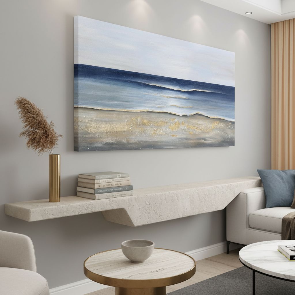
If your room runs warm in palette, terracotta, rust, ochre, deep wood tones, this canvas’s cool blue foundation is going to fight rather than complement. The composition reads as contemporary and somewhat bold, so very traditional rooms, think antique furniture, heavy drapery, crown molding in a historic property, will find the aesthetic tension uncomfortable rather than interesting. This is also not a piece for tight walls. The 30×60-inch format needs room to breathe; if your available wall runs shorter than 48 inches wide, the proportions will feel crowded. And if you genuinely prefer art that whispers rather than speaks, this one speaks. Browse our full living room decor category for quieter alternatives that still provide visual intention. You might also find useful scale guidance in House Beautiful’s room-sizing coverage.
What It Replaces in My Space
What it replaced was not a single item but a mood, specifically the mood of a room that had everything it needed except a reason to look at it. I’d had a gallery wall there for about a year, five frames in a mix of sizes, some art prints, one photograph I liked well enough. The arrangement was technically fine and aesthetically nothing. The canvas replaced all five frames with a single decision, and the visual quieting that happened in the room afterward was immediate. I also retired a decorative shelf that had been sitting below the gallery wall doing minimal work, replaced it with something lower and cleaner, and now the whole wall from baseboard to ceiling has a logic it never had before. It’s the kind of small edit that makes you wonder what you were so busy looking at before.
If you’re considering a similar living room refresh but aren’t sure where to start, our editor-curated decor recommendations are organized by room and style, including a coastal-modern section that pairs well with pieces like this one. And if you’re looking for gift context, this canvas also appears in our curated home decor gift ideas guide for people who actually want something impactful.
FAQ
Is 30×60 inches too large for a standard living room wall?
For most standard 8-foot-ceiling rooms with a sofa wall of 72 inches or wider, the 30×60 format works well and reads as intentional rather than overwhelming. For smaller rooms or walls under 60 inches wide, it may dominate uncomfortably.
Does the canvas arrive ready to hang or does it need stretching or framing?
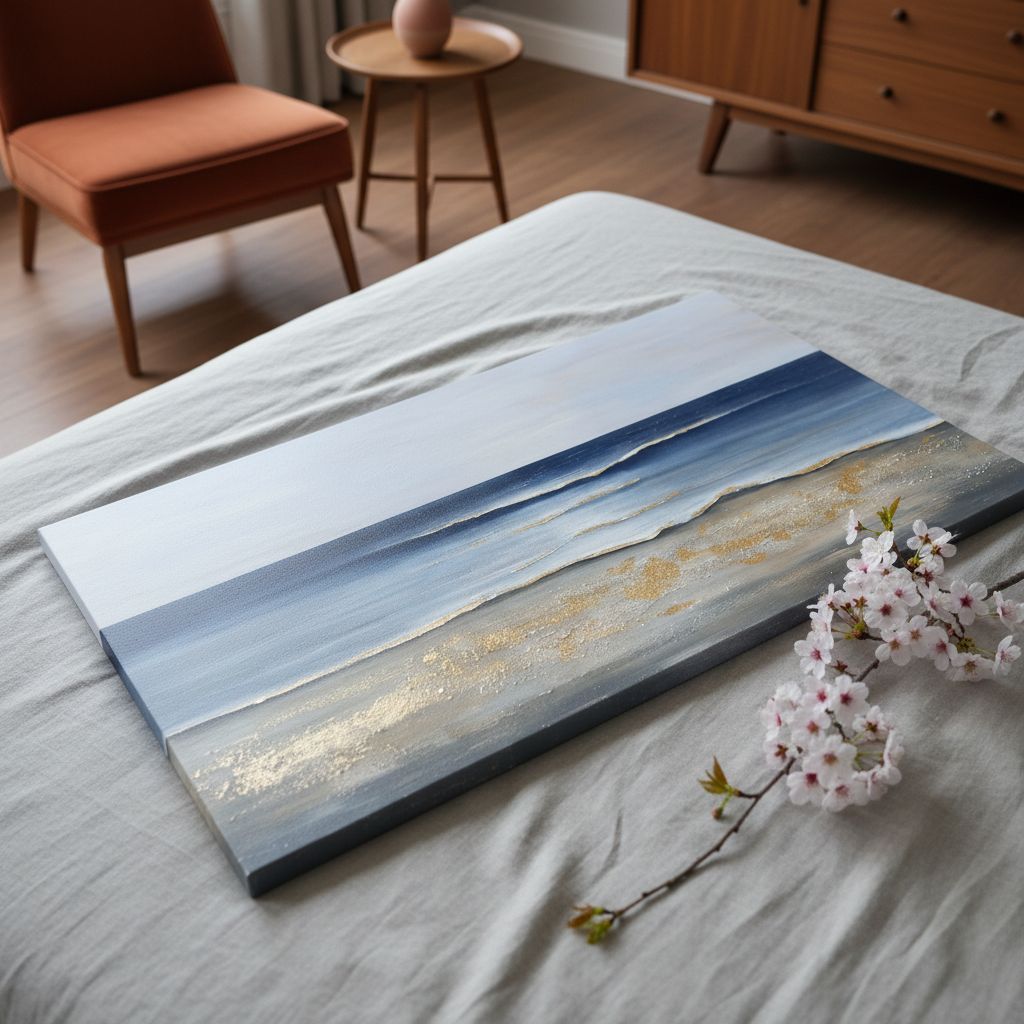
The canvas arrives rolled, not pre-stretched on a frame, so you will need either a canvas stretching service or a custom floating frame to display it flush against the wall as intended. Factor this into your planning timeline.
Does the blue palette read differently in warm-toned versus cool-toned lighting?
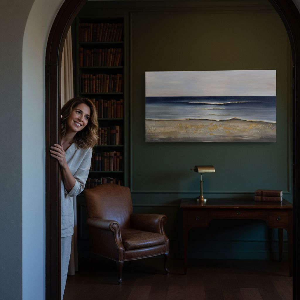
Yes, noticeably. Under warm incandescent or Edison-bulb lighting, the blues take on depth and the gold accents warm considerably. Under cool overhead LED lighting, the palette reads truer to the product photos, more crisp and contemporary.
Is the quality consistent with the price point for this category?
For what you’re paying, the level of finish reads above expectations. The canvas weight is substantial, the color saturation is strong without looking digitally oversaturated, and the gold accent work has a layered quality that doesn’t appear in the lowest tier of printed canvas art.
What’s the return process if the scale doesn’t work in my space?
Check the listing at time of purchase, as return policies on oversized rolled canvas can vary. It’s worth measuring your wall carefully before ordering rather than relying on returns for a piece this large.
The Verdict
Six weeks in, the Yuaxker Ocean Canvas Wall Art is still the first thing I notice when I walk into the room, which is exactly what a piece this scale should do. It has changed the temperature of the living room in a way I didn’t anticipate, making a space that used to feel slightly provisional feel genuinely settled. I think about how it will look in different seasons, how the blues will feel in summer versus the depths of February, and I find myself looking forward to both. The gold accents age well with changing light rather than fighting it. This is not a subtle piece, and it is not trying to be. If you have a wall that needs an anchor and an aesthetic that leans coastal-contemporary or modern abstract, this canvas is one of the more confident recommendations I can make in this category. The value reads clearly above what you’d expect for the format and finish. Get the wall measurement right, give it room, and let it work.
The verdict: buy it for a wall that’s been waiting for a reason to exist, and don’t look back.
Every Angle
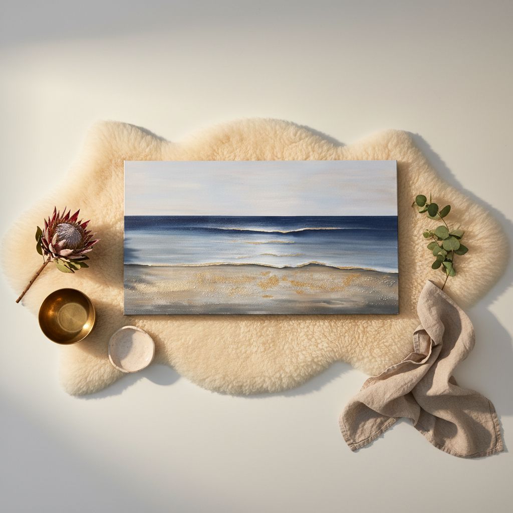
The piece as photographed for Amazon — front, side, back, detail.
As an Amazon Associate I earn from qualifying purchases.